Stop Retyping Prompts: Master .prompt.md Files in VS Code Copilot
Write your best prompts once as .prompt.md files and invoke them instantly with /prompt. Save time, ensure consistency, and share prompts across your ...
Building and breaking secure things in Azure using AI. I occasionally write about things I find interesting.
Write your best prompts once as .prompt.md files and invoke them instantly with /prompt. Save time, ensure consistency, and share prompts across your ...
Discover how forking context in VS Code Copilot saves 70-80% of tokens while exploring multiple solutions simultaneously. A productivity game-changer ...
Introduction As a mobile app developer, you're constantly looking for ways to simplify your development process while still delivering feature-rich, high-quality applications. Xamarin is an excellent choice for building cross-platform mobile apps, and Xamarin.Essentials is a powerful companion library that can save you time and effort by providing access to native APIs through a single, unified interface. In this blog post, we'll explore the Xamarin.Essentials library, its most useful features, and how developers can easily integrate these components into their Xamarin projects. What is Xamarin.Essentials? Xamarin.Essentials is a library that provides developers with a wide range of cross-platform APIs to access native device features using a shared codebase. It eliminates the need to write platform-specific code for common app functionalities like accessing the device's file system, geolocation, or connectivity information. Xamarin.Essentials is compatible with Xamarin.iOS, Xamarin.An...
If you are looking to become a Security Engineer or already started on the path, below is a learning path that could be followed to achieve the goal. - Learn the basics of computer networking: Start by learning the fundamentals of computer networking, such as the OSI model, network topologies, and protocols. You can find plenty of resources online, such as videos and tutorials. - Familiarize yourself with networking devices such as routers, switches, firewalls, and load balancers. - Learn about IP addressing, TCP/IP, DNS, and DHCP. These are the building blocks of network communication and are essential for a security engineer. - Practice configuring network devices, such as setting up VLANs, access control lists, and VPNs. - Links Cisco Networking Academy: https://www.netacad.com/ - Udemy: https://www.udemy.com/topic/networking/ - Computer Networking Basics: https://www.computernetworkingbasics.com/ - Gain proficiency in programming: Choose a programming language to focus on, such as ...
Azure is constantly adding new tools to its arsenal and although Azure Data Factory is not new but I have been recently working a lot with it to manag...
WHO has declared Coronavirus a global pandemic and almost every country in the world is impacted by it. A lot of people are trying to track the state of pandemic and it's impact. A lot of people and organizations have come forward to help in this global crisis. But just like everything else where there is good there is evil. Malicious apps, websites, scams and ransomware have spun up to take advantage of the situation. One of the ransomeware app it the Covid 19 Tracker which promises to give you the real time tracking of the spreading virus near you. But in the background changes the password of your android phone and locks it. It then demands $100 in Bitcoin to be paid to be able to unlock your phone. Be safe and just like always visit only the sites you trust and please refrain from installing untrusted apps on your mobile phone. Microsoft has delivered the fastest project of this size that I know of to provide accurate and up to date information on the coronavirus (COVID-19). You ca...
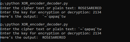
XOR cipher is a simple additive encryption technique in itself but is used commonly in other encryption techniques. The truth table for XOR cipher is ...
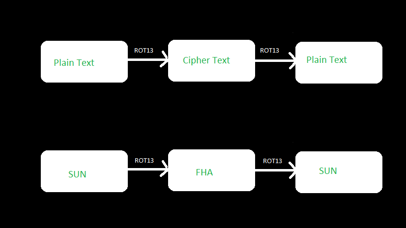
ROT13 is a letter substitution cipher and a special case of Caesar Cipher where each character in the plain text is shifted exactly 13 places. If you ...
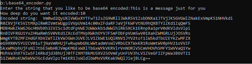
Base64 is a binary to text encoding technique rather than an encryption technique but I thought it made sense to cover it in this series because it is...
If you have ever been interested in cryptography or started to learn about it then there is a high probability that you would have come across Caesar ...

We all understand the concept of boxing and unboxing in Cbut type casting is a bit more complicated and we do have more than one option to accomplish it. The two options that we have is 1) Have an explicit cast to specific type or 2) Use the as keyword for type casting. Let's look at each one of those in a little detail in code I am going to call the type casting without any keyword as standard type casting. Below is a code example of one of the ways of doing it right. c object obj1 = new object(); try { Person person1 = (Person)obj1; Console.WriteLine(person1); } catch(InvalidCastException castException) { Console.WriteLine(castException.Message); } It is apparent from the code that the object we are trying to cast to typeof Person is not actually a person and hence will be unsuccessful, so we are prepared for it by catching the InvalidCastException. This is exactly the problem when using the standard type casting. We can avoid getting an exception during type casting by using the as ...
IOT is the next technological wave and we all would be riding it weather we want or not. As a technologist by hobby and profession I like idea of ever...
While opposed to the typical way to deal with working self-driving autos, Nvidia didn't program any categorical question discovery, mapping, way arranging or control parts into this auto. Somewhat, the auto learns all alone to make all fundamental inside representations important to guide, by simply observing human drivers. The automobile effectively explores the growth site while liberating all of us from making particular finders for cones or different articles present at the website. Also, the auto can drive out and about that is congested with grass and shrubs without the need to make a vegetation recognition platform. All it takes is around twenty illustration operates driven by people at various times of the afternoon. Figuring out how to drive during these head boggling situations exhibits new skills of profound nerve organs systems. The auto also figures out how last but not least its driving conduct. This video incorporates a form that demonstrates an automobile that was prepa...
The only future of web applications is with SSL and TLS however this is a nightmare for me and many other web application developers. When we moved al...
All of us need to capture the screenshot of the browser one time or another and I have used many third party freemium extensions over time but nothing...
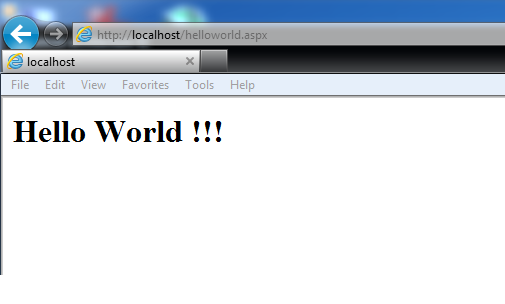
In this blog post we are going to talk about the basics and new features in ASP.NET 5 and Visual Studio 2015 by creating our favourite Hello World Pro...
Today I am going to share a program that I wrote sometime back when I was learning to work with Selenium. I had a lot of people commenting and subscri...
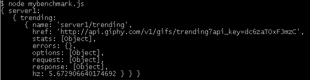
I recently came across a great tool for benchmarking your APIs. It's a nodejs tool written by Matteo Figushttps://github.com/matteofigus. Complete...
While searching on how to utilize Google Analytics on my website I came across this book which proved to be very useful guide by Ben Barden Download A Beginner’s Guide to Google Analytics (1.5MB PDF) Putting it out there for anyone else who might be looking for a quick start on google analytics.
Grunt is a JavaScript Task Runner. Any task runner is used for automating the repetitive tasks to increase productivity and efficiency. Some of the automated tasks include - Implement standards - Unit Testing - End to end testing - Compiling - Automated task execution - File watching Grunt is a command line tool available on the node platform. Once you have installed node, you would need to run the following command to make grunt command line available in your project. npm install -g grunt-cli To run grunt commands we would also require to create a Gruntfile.js because depending on the make of the grunt tool it looks for this file. Once we have this file then we could configure tasks inline, load tasks from external sources (files and modules), etc. It’s always easy for me when I do some hand on so that’s what we would do. Create a new file named Gruntfile.js and add the following code to it. js // Code example to automate minification of an existing javascript file module.exports = fu...
The new ransomeware first discovered by @Trojan7Sec. Once it encrypts all the data on your system then you would see the following message. It also adds a text file on your desktop with the details of making the payment and collecting the decryption key. The payment website looks like below Ransom Page Fake Ransom This ransomware does not securely delete your files or remove the shadow volume copies so it is still possible to recover your files using a file recovery tool or a program like Shadow Explorer. More information on this can be found @trojan7malware.blogspot.co.uk
Do you use Keurig 2.0 or know anyone who does? Then you might interested in knowing that the Keurig 2.0 Coffee Maker contains a vulnerability in which the authenticity of coffee pods (commonly known as K-Cups) uses weak verification methods and which could be subject to a spoofing attack through re-use of a previously verified K-Cup. The complete hack is demonstrated at a video below: https://www.youtube.com/watch?v=9e0yCq1AEeY The complete details of the vulnerability can be found at caffeinesecurity This information is for educational purposes only. Please do not use it for any illegal purposes.
Make sure you patch your system to fix the kernel-mode driver vulnerability. This vulnerability could allow remote code execution in the following Windows Operating systems - Windows Server 2003 - Windows Server 2008 - Windows Server 2008 R2 - Windows Server 2012 - Windows Server 2012 R2 - Windows 7 - Windows 8 - Windows 8.1 You will find more details about the vulnerability and its fix here at Microsoft.com
Figuring out whether your machine is continuously observed can be a test, contingent upon the checking method's level of refinement. Older machines used to run slowly while being observed, however present day machines have enough power to make observing unclear. Checking for observing fittings and programming is a methodology of end and not secure. So we will resort to a more foolproof mechanism of determining if someone is connected to your system and you have not authorized that connection. Open the Run Window by either pressing Windows + R or typing Run in the Start Menu of Windows and type cmd Now type the command netstat -ano. netstat (network statistics) is a command-line tool that displays network connections (both incoming and outgoing), routing tables, and a number of network interface (network interface controller or software-defined network interface) and network protocol statistics. -a -- Displays all the network connections along with all the TCP and UDP ports on which you...
If you answered yes to the above question then think again. Generally we are not as secure as we might think. In this blog I will be sharing various concepts, tutorials, tips and techniques so that all of us can understand different types security risks and how we could save ourselves from a lot trouble.
Inset Text In Pure CSS

In this post we will talk about building RESTful services. However before we do that I would recommend reading the previous part of the series
In this post we will talk about elements of RESTful architecture. However before we do that I would recommend reading the previous part of the series
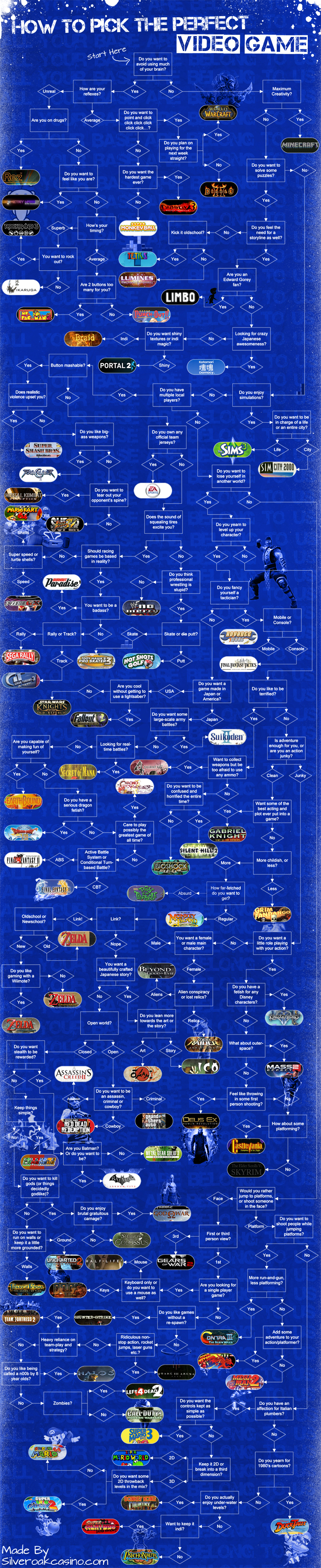
Here is the flowchart you could use to pick up the perfect video game according to your mood.
In this post we will derive REST from constraints. However before we do that I would recommend reading the 1st part of the series...
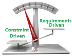
I have been learning and working on REST for a while now. But I have on many blogs that there are disconnects between what REST actually is and what i...

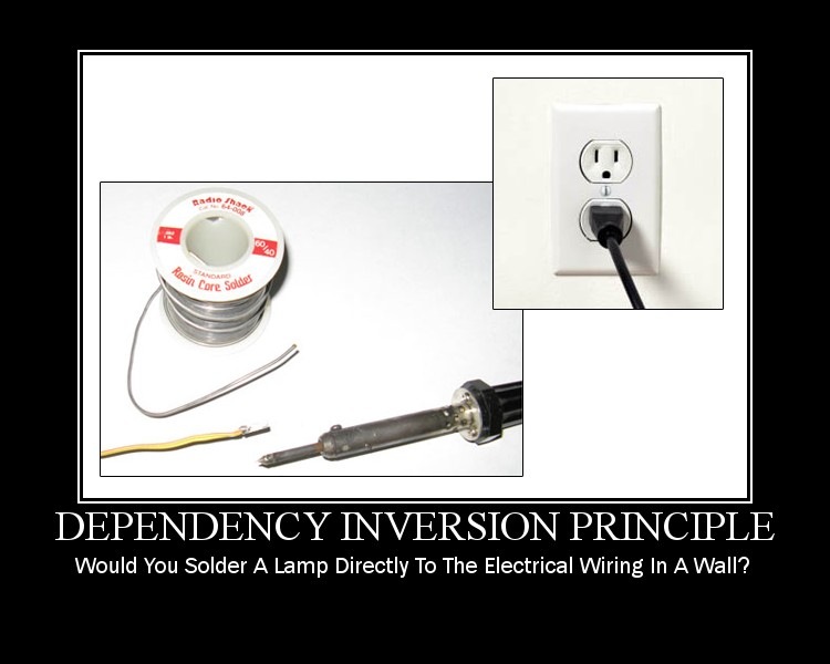
DIP states that the higher level modules should be coupled with the lower level modules with complete abstraction. Meaning
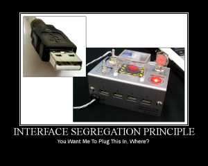
The Interface Segregation Principle states that the clients should not be forced to use the methods that they do not use.
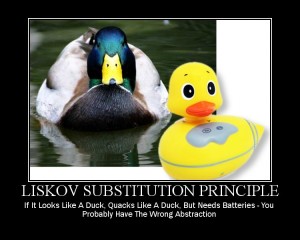
Liskov Substitution Principle can be considered to be an extension of the Open / Closed principle which states the base class reference should be repl...
The Open / Closed principle states

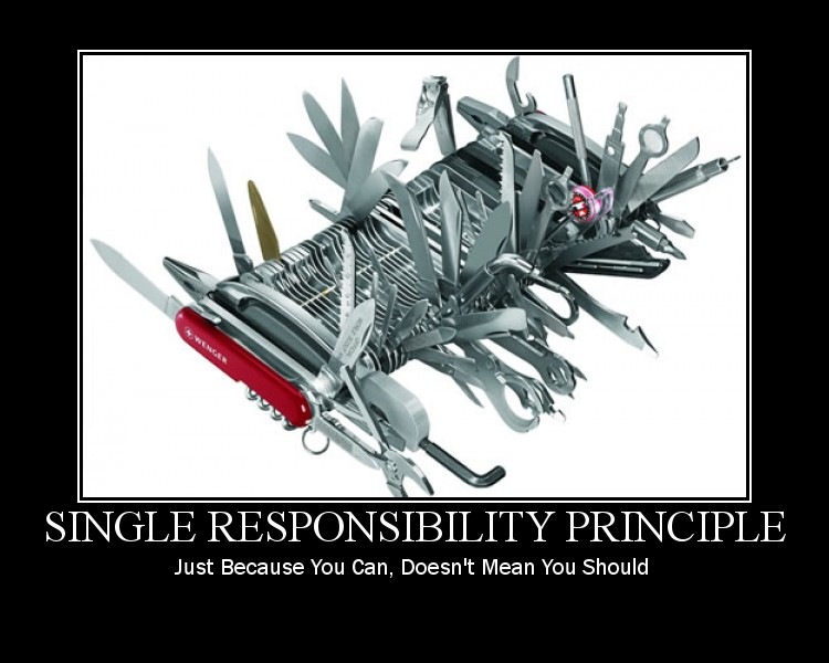
In this series i will talk about the SOLID Design Principles. We will discuss one principle in each post.
In this post we will have a look at layout and navigation options available in CSS3.
In this post we will talk about
In this post we will talk about
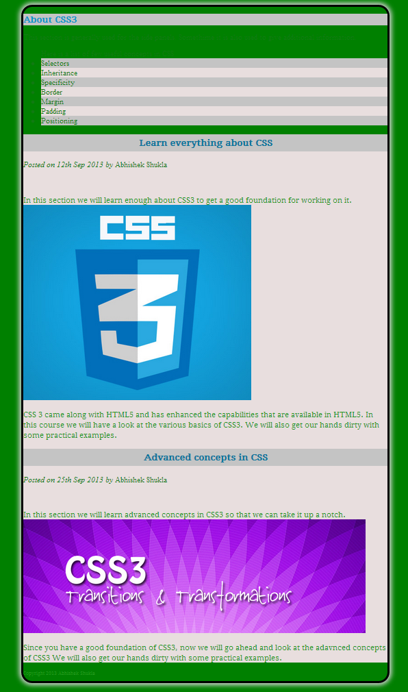
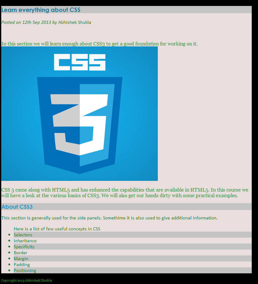
In this post we will be covering the basic concepts in CSS3 along with some hands on examples. The topics that we will cover in this post are:

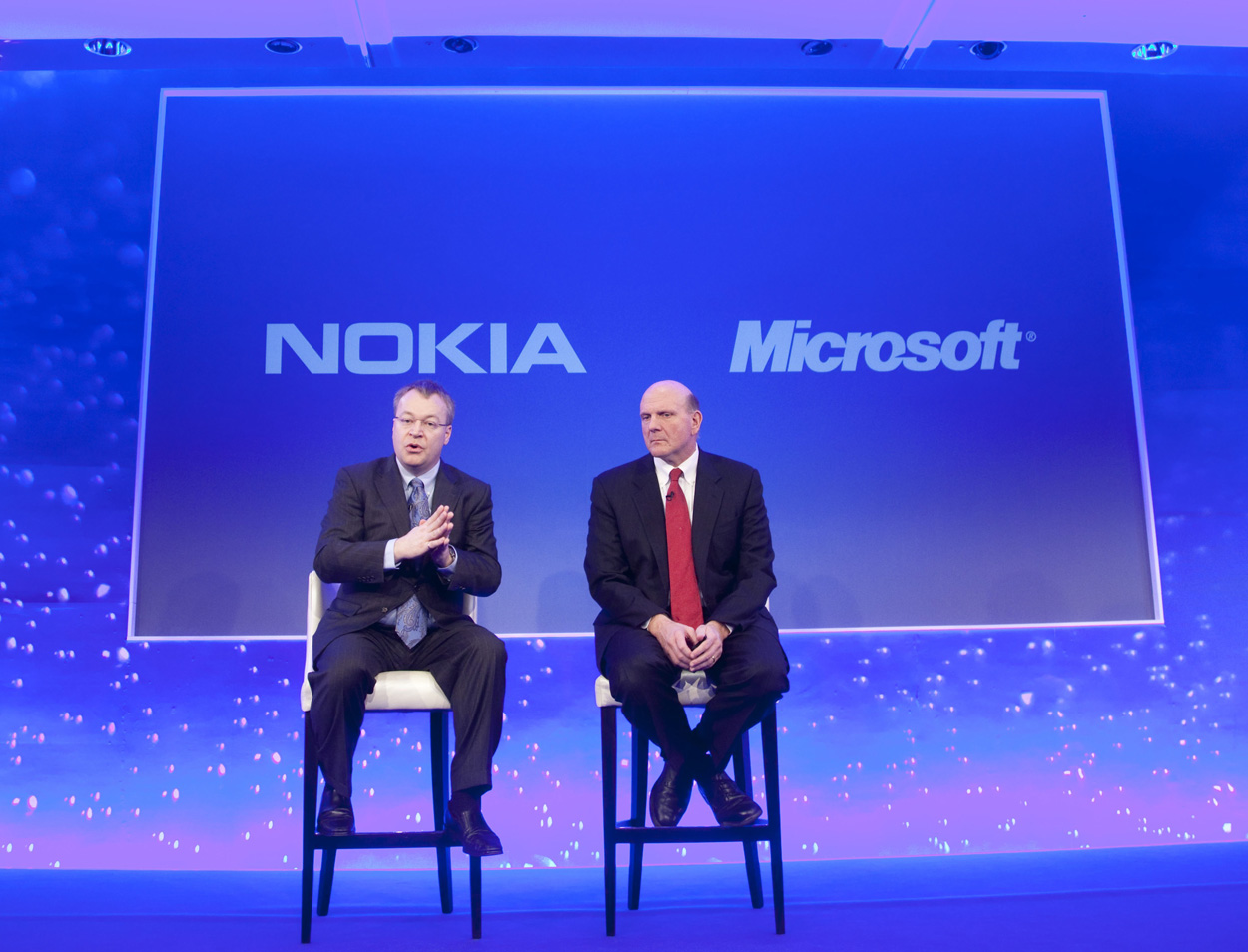
Microsoft will purchase Nokia’s Devices & Services business
Git does not take care of the access control so we need to additional software for that and that’s where hosted solutions like GitHub and BitBucket come in and also self-managed solutions like Gitosis and Gitorious come in. Help git help – provides help on all commands git help commandName – provides help on specific command Config git config - - global user.name “username” git config - - global user.email abc@xyz.com git config - - global color.ui true – Get pretty colors on the output of our command line git config - - global core.editpr emacs – use emacs for interactive commands git config - - global merge.tool opendiff – uses opendiff for merging conflicts git config user.email “email” – sets the email for the current repository Starting a Repository mkdir store – create directory cd store – change to directory git init – Initialize the empty repository in the local system or we could directly create a repository in the current folder git init sample-dev-proj and then navigate to t...
An array is a collection of objects and these objects may be of different types. The difference between both these types of initialization is that JavaScript engine interprets the literals every time the array is accessed. Initialization We can also initialize the array to a specific size. We could also assign values particular elements of the array and when we do this the other elements will be undefined. You can see the same in the sample below where we have used for loop to show the elements of the array. The elements of an array can be assessed directly by the 0 based index. We can use this 0 based index to get or set the value at a particular index. function arrayDeclaration() { var arrayObj = new Array("Item 1", 2, true); var arrayObjWLiterals = ["Item 1", 2, false]; var arrayWithSize10 = new Array(10); // initializes array with size 10 var arrayWithUndefinedElements = ["Item 1", , "Item 3", , "Item 5"]; console.log(arrayObj); // ["Item 1", 2, true] console.log(arrayObjWLiterals)...
The math object in JavaScript does not have constructor so we cannot instantiate it. All the methods and properties can be assessed directly from the math object. Math Object Properties The following properties are available on the math object | E | Returns Euler's number (approx. 2.718) | | | LN2 | Returns the natural logarithm of 2 (approx. 0.693) | | | LN10 | Returns the natural logarithm of 10 (approx. 2.302) | | | LOG2E | Returns the base-2 logarithm of E (approx. 1.442) | | | LOG10E | Returns the base-10 logarithm of E (approx. 0.434) | | | PI | Returns PI (approx. 3.14) | | | SQRT12 | Returns the square root of 1/2 (approx. 0.707) | | | SQRT2 | Returns the square root of 2 (approx. 1.414) | | Math object methods The following methods are available on the math object. | abs(x) | Returns the absolute value of x | | | acos(x) | Returns the arccosine of x, in radians | | | asin(x) | Returns the arcsine of x, in radians | | | atan(x) | Returns the arctangent of x as a numeric value b...
Just like the string object the number object can behave as a value type or object. The number in JavaScript is equivalent to the float in any other programming language but it behaves both as a float or an integer depending on whether the decimal is present. Assign Value to number We can either directly assign a value to the number or we use the number constructor to do that. var num = 5; console.log("Value assigned to num by initializing without constructor = " + num); // Value assigned to num by initializing without constructor = 5 num = new Number(25); console.log("Value assigned num by initializing with constructor = " + num); // Value assigned num by initializing with constructor = 25 num = 3.14; console.log("Float value assigned to num = " + num); // Float value assigned to num = 3.14 Maximum value of number The maximum value of number in JavaScript is 1.7976931348623157e+308 and values larger then this are considered infinity. console.log("maximum value of number in javascript ...
In this post we will talk about timers and their usage in JavaScript Timers are available in the Window object. It takes two parameters the time in milliseconds and expression or the function. We have 2 types of timers: setInterval (func, milliseconds) – this timer is recursive and will evaluate the expression each time when the timespan that we have specified occurs. setTimeout (func, milliseconds) – this timer is executes the expression once when the timespan we specified is passed. We also have clear method available on both types of timers. clearInterval (id) – takes the id of the timer to clear so that the specified code is not executed at specified intervals. clearTimeout (id) – takes the id of the timer to clear so that the specified code is not executed at specified timeout time. Another thing to keep in mind about the timers is that the timers run on the same thread as the UI events. All JavaScript in the browser executes in the single thread asynchronous events and this force...
Hi guys, In this post we will walk through the Date object that is available in JavaScript and the various capabilities of that object and various ways can use it in our application Date in JavaScript is powerful enough to suffice for most of the requirements we have in our applications. Interesting thing to note here is that numeric value of date is the number of milliseconds that have lapsed after 01Jan1970 UTC (all the leap time is ignored). Another interesting thing that we can do with date in JavaScript is create a future date by adding days, hours, months, etc. The various methods available on Date are: | getDate() | Returns the day of the month (from 1-31) | | | getDay() | Returns the day of the week (from 0-6) | | | getFullYear() | Returns the year (four digits) | | | getHours() | Returns the hour (from 0-23) | | | getMilliseconds() | Returns the milliseconds (from 0-999) | | | getMinutes() | Returns the minutes (from 0-59) | | | getMonth() | Returns the month (from 0-11) | | |...
I am currently reviewing Instant Dependency Management with RequireJS How-to by Greg Franko PACKT Publishing.

In this post i am going to talk about the capabilities available in JavaScript for strings. Strings Strings are bunch of characters or spaces grouped together. Strings can be represented placing these characters inside single quotes (‘ ’) or double quotes (“ ”). Inside these single and double quotes we could use zero or more characters. - Strings are the most used datatype in Javascript. - They are used within the client side JavaScript code. - When making an ajax call to the server. - Serializing the JavaScript objects passed over the wire. - The ToString method is available on the JavaScript objects and it returns the string representation of the object in serialized format. - One of the JavaScript primitive types (number, Boolean, null and undefined). It can be an object as well. - Strings are JavaScript literal format for number, Boolean, arrays, objects and regex. Note – A literal is a notation for representing fixed value in the source code. - Represented by single quotes (‘I am ...
Hi Guys, In this post i am going to talk about how we could create an auto complete text box in HTML5 using DataList. Also we will see how we could use knockout to bind an observable array to the auto complete list. Then we will populate the data depending upon the selection of a user. The first thing that we need to do is add a Scripts folder and then download the knockout.js into that folder. Then we will include the knockout.js script file into our html page. [hr] HTML 5 Datalist Knockout Auto Complete Text Box [hr] Now just below the script tag add another script tag. In this script tag we will define our view model with which we will bind our html view. [hr] function userViewModel () { this.users = ko.observableArray(); this.username = ko.observable(''); this.users.push("Abhishek Shukla"); this.users.push("user 1"); this.users.push("user 11"); this.users.push("user 2"); this.users.push("user 22"); this.currentUser = { firstName: ko.observable(''), lastName: ko.observable(''), addr...
Hi, In the session we will have a look at how to what are the various collections available in .NET. And how could we use them. We will be covering the following topics o List and Dictionary o ArrayList and HashTable o Generic Classes & Methods o IEnumerable and IEnumerator Apparently the guys did not pay me for the job they hired me for so i am sharing the video for free with everyone out there. [youtube=http://www.youtube.com/watch?v=3zFyeS00-Tg&w=640&h=385] The full source code of the module is available here. Any questions, comments and feedback are most welcome.
Hi, In the session we will have a look at how to develop console applications using .NET. We will be covering the following topics o Entry point method – Main o Command Line Parameters o Compiling and Building Projects Apparently the guys did not pay me for the job they hired me for so i am sharing the video for free with everyone out there. [youtube=http://www.youtube.com/watch?v=I6zLFfV6pCs&w=640&h=385] The full source code of the module is available here. Any questions, comments and feedback are most welcome.
Hi, In the session we will have a look at how to Work with Classes and Objects using .NET. We will be covering the following topics o Adding Variables and Methods o Properties and Indexers o Constructors and Destructors o Type Initialize o Extension Methods o Anonymous Types o Memory Management and Garbage Collection o Shared / Static Members o Method Overloading o Anonymous Methods o Partial Classes & Methods o Operator Overloading o Inner Classes o Attributes and their Usage Apparently the guys did not pay me for the job they hired me for so i am sharing the video for free with everyone out there. [youtube=http://www.youtube.com/watch?v=JsMeA64321o&w=640&h=385] The full source code of the module is available here. Any questions, comments and feedback are most welcome.
Hi, In the session we will have a look at Object-Oriented Programming using .NET. We will be covering the following topics o Object and Class Definition o Understanding Identity, State, and Behavior o Using encapsulation to combine methods and data in a single class o Inheritance and Polymorphism. Apparently the guys did not pay me for the job they hired me for so i am sharing the video for free with everyone out there. [youtube=http://www.youtube.com/watch?v=FLm063JBEqs&w=640&h=385] The full source code of the module is available here. Any questions, comments and feedback are most welcome.
Hi, In the session we will have a look at .NET Language Basics. We will be covering the following topics - Variables and Data Types - String & StringBuilder - Boxing and Unboxing - Operators - Statements - Arrays and Strings - Procedures and Functions Apparently the guys did not pay me for the job they hired me for so i am sharing the video for free with everyone out there. [youtube=http://www.youtube.com/watch?v=OW8GZpLUVY&w=640&h=385] The full source code of the module is available here. Any questions, comments and feedback are most welcome.
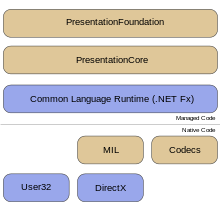
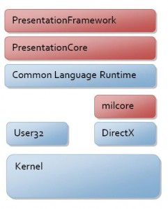
Hi, In the session we will have a look at the following topics - The .NET Framework - an Overview - Architecture of .NET Framework - Types of Applications which can be developed using MS.NET - MSIL / Metadata and PE files - The Common Language Runtime (CLR) - Common Type System (CTS) - Common Language Specification (CLS) - Types of JIT Compilers - Security Manager - MS.NET Memory Management / Garbage Collection - MS.NET Base Classes Framework - MS.NET Assemblies and Modules - Windows Workflow Framework [WF] - Windows Presentation Framework [WPF] - Windows Communication Framework [WCF] - CardSpace Apparently the guys did not pay me for the job they hired me for so i am sharing the video for free with everyone out there. [youtube=http://www.youtube.com/watch?v=DiAChgIcNg&w=640&h=385] The full source code of the module is available here. Any questions, comments and feedback are most welcome.
I have developed a simple CSharp application that gives you random characters to type and records the key presses and also increases the speed of the ...

Recently I had a requirement in which I had to run an application directly from a DVD. So I made a demo application so that I can share it with you gu...
I am sharing my latest application which is a address book developed in WPF and C using MVVM pattern.

A couple of times a faced an issue while working on code. I wanted to check which files I edited since yesterday or since a specific date as in a fold...

What do we do and what does IDE do

WPF being a fairly new technology might need to communicate with the components that are made in other technologies so in this section we will have a ...

In this section look into multithreading in WPF and how we can send long running task to a different thread than the UI thread. We will look at how th...
Styles give our applications and elements consistent look and feel. In this section we will see how style hooks up to the resource system and property...

In this section we will see how we can add printing support in WPF applications. We will start off with printing and XPS and then move on to XPSDocume...

The rivalry between Apple and Google has reached a new superlative -- Apple has declared that the latest type of their ambulant OS, iOS 6, which testament run on the iPad, iPhone and iPod speck, testament not countenance the touristed video moving app, YouTube, someone out of the box. The boys at Cupertino say that the app faculty be disposable on iOS, but won't be a place impede fail. Still, the video streaming accommodation will be noneffervescent useable to users via the web browser. The removal of YouTube as a individual app is a bit of a downer for users, and sure intensifies the tension between the two technology giants. Apple had recently announced that it would be replacing Google Maps in iOS with its own maps app. Currently, Apple and Google are the marketplace dominators with their several rangy OSes i.e., iOS and Humanoid respectively. Apple seems to be action all the indispensable steps to size itself from competition Google. What remains to be seen is whether Google module...
The Apple Worldwide Developer's Conference saw everything from refreshed Macbook constituent Air and Pro, to a new developer advertising of Elevation....
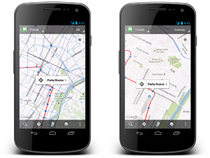
Google has announced an update to its map activity, Google Maps, for manoeuvrable devices. The update v6.1 focusses on listing for exoteric transit op...
India has had its name of giving low-cost IT labor for long however the name could be in peril tells U.S. a study conducted by Cushman & Wakefield and Hurleypalmerflatt named ‘Data Centre Risk Index’ . The study evaluated “Data Centre Risk Index” i.e., the risks to international knowledge center facilities and international investment in business vital IT infrastructure. In the survey, Asian country scored associate degree unsurprising second position within the most risk ridden knowledge Centre location among prime thirty countries, the last being Brazil. The center of world outsourcing over the past few years might not look therefore enticing anymore! This could ensue to India’s low score in “Ease of Business”, “Inflation”, “per capita GDP” and “Corporate Tax”. The recent grid collapse solely adds to such an occasional ranking of Asian country within the study. Arvind Nandan, administrator, practice, India, Cushman & Wakefield says, “India and key Asian economies stay most popular lo...
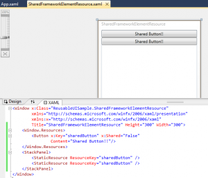
In this section we will have a look at how we can reuse resources, templates, xamls, custom elements and custom controls.
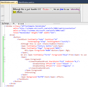
In this section we will look WPF text formatting in layout services. We will have a look at text rendering feature, text layout services, text object ...
In this section we will talk about Resource handling service of WPF and support for Internationalization
WPF Customization Continuum
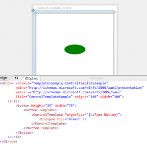
DependencyObject DependencyObject provides WPF property system. The WPF system needs the needs the properties to have a richer set of services like change notification is required for triggers and data binding. So apart from Change Notifications we also need Default Values, Type Coercion, Data Binding, Attached Properties, Validation, Inheritance down the Visual Tree and Styling to be available for the properties. It’s not feasible to implement all these features to a property every time we use it, so it’s really helpful to have these features already present in the properties. DependencyObject is the base type of most of the types we work in WPF and hence they already have all these features of the DependencyObject. DependencyProperty To use a dependency Property we need to do the following things. - Derive from DependencyObject - Register the DependencyProperty by passing the name of the property, the type of the property, the type that owns the property and the metadata for the prop...
Data Binding is one of the most important services offered by WPF. Data Binding just means connecting the user interface to the information to be disp...

Let’s talk about graphics in WPF. We would talk about the WPF graphics architecture followed by vector graphics, bitmaps and videos, WPF resolution...
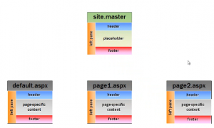
The most important thing to have in the website is a consistent look and feel for the whole website and it involves have a similar colour scheme and s...
HTML Controls are collection of the server side controls that give the server side representation of the client side HTML elements. We can create a se...
This line of tutorials will take you through all the ASP.NET fundamentals
In this section we will see how we can break our pages into small pieces by the use of User Controls. If you have worked even once on Silverlight you ...

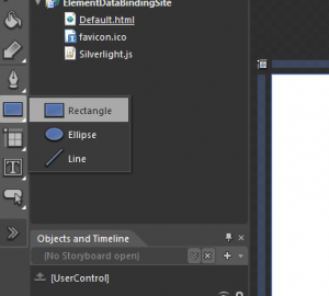
Working with Data in Expression Blend 4
As you would all know that the building blocks of an application are controls but you need to know the layouts as well to know where and how you can p...

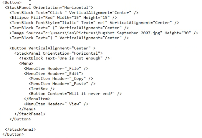
In this part 2 of learn WPF we are going to talk about Controls and see how these controls are different in WPF and what capabilities it provides you ...
In this I am going to start talking about Windows Presentation Foundation or WPF in short. I hope you guys find this series interesting and informativ...
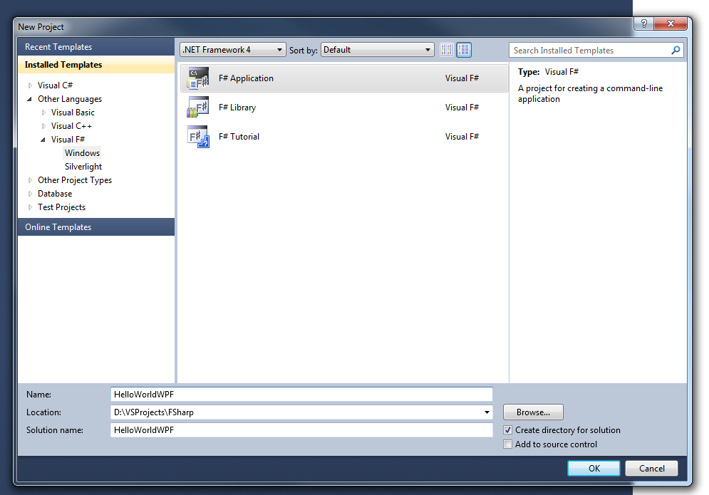
In this post i am going to talk about about the F application structure.
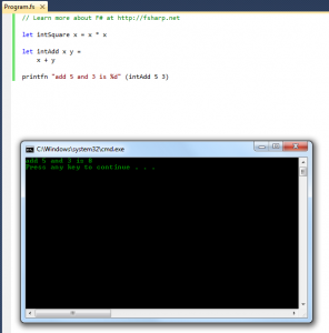
In this one i am gonna talk about how we can create and call functions in F.
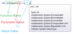
In this post i am going to talk about Values, Data Types and Types Inferences in F.

In this post we would talk about REPL which is the provided by the F interactive enviorment. It could be used as tool window inside Visual studio or a...

Control Customization
Hope you guys had a look at my other F posts/blog/
Hope you guys had a look at my previous F post/f-hello-world-console-application/
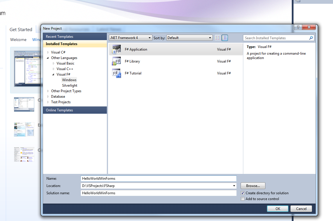
I am always exited to learn something new and hope you guys feel the same way. Today i am going to share as to how we can write a Hello World console....
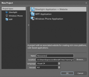
Resources in Expression Blend
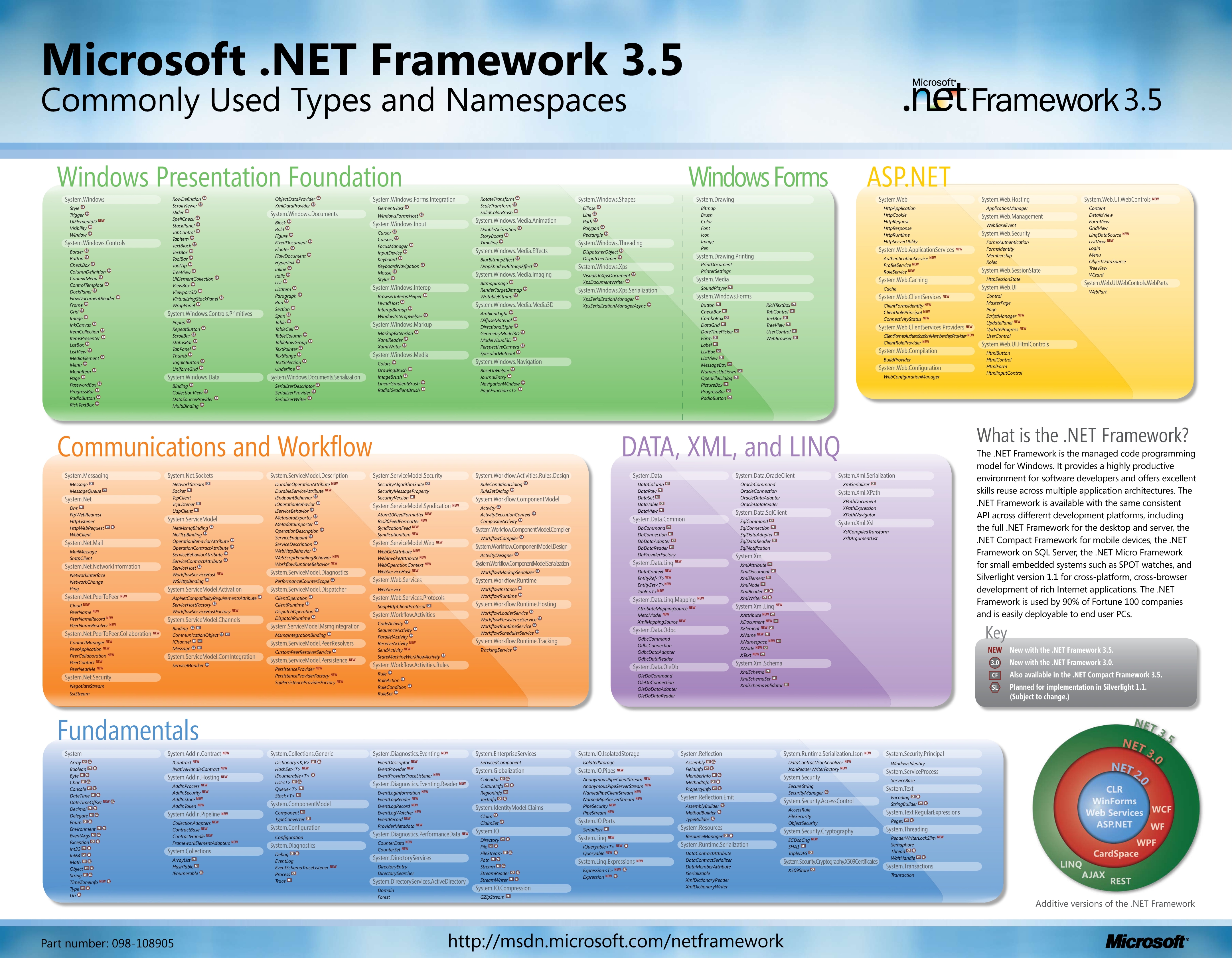
While searching for .NET posters on internet i came across this one. This has most of the .NET Framework 3.5 commonly used types and namespaces.
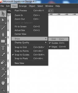
I am back with the 4th tutorial on MS Expression Design and in this one we will cover the concepts of Grid, Guides and Points. Hope you have gone thro...
I am back with the 3rd tutorial on Microsoft Expression Design and this time we are going to talk about Zooming and Scrolling features in Expression D...
This is the 2nd tutorial on Expression Design and in this one we will work with panels in Expression Design. So without wasting a lot of time let me t...
I am back with another tutorialand this time it is basics of MicrosoftExpression Design. I know that a lot of you guys would like to use Expression de...
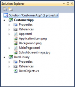
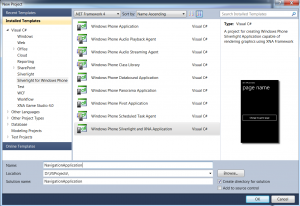
Lets learn about creating Windows Phone Projects
Here is some exiting news. Microsoft is giving credits to search on there search engine "Bing".
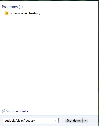
Tired of your Outlook’s slow performance, unwanted reminders popping up, or feeling that your calendar is messed up? Here are few tips and tricks tha...
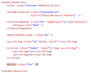
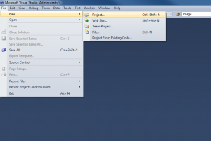
What is a resource in terms on .net?
The list of useful run command is as below : | Run Commands Listed below In Alphabetical OrderProgram | Run Command | | | Accessibility Controls | access.cpl | | | Accessibility Wizard | accwiz | | | Add Hardware Wizard | hdwwiz.cpl | | | Add/Remove Programs | appwiz.cpl | | | Administrative Tools | control admintools | | | Adobe Acrobat ( if installed ) | acrobat | | | Adobe Distiller ( if installed ) | acrodist | | | Adobe ImageReady ( if installed ) | imageready | | | Adobe Photoshop ( if installed ) | photoshop | | | Automatic Updates | wuaucpl.cpl | | | Basic Media Player | mplay32 | | | Bluetooth Transfer Wizard | fsquirt | | | Calculator | calc | | | Ccleaner ( if installed ) | ccleaner | | | C: Drive | c: | | | Certificate Manager | cdrtmgr.msc | | | Character Map | charmap | | | Check Disk Utility | chkdsk | | | Clipboard Viewer | clipbrd | | | Command Prompt | cmd | | | Command Prompt | command | | | Component Services | dcomcnfg | | | Computer Management | compmgmt.msc | | |...
Let me tell you some facts that you should know if you like computers....Not sure if all of them would come like a surprise to you but i guarantee that some of them will..... So, here it goes. Ten myths and there truths. - The internet was a military network designed to survive a nuclear attack - The precursor to the internet (APRANET) was funded by a branch of the US defence department. Howerver, its purpose was communication between universities and not war. - Al Gore invented the internet - US Congressman, Al Gore promoted the concept of "comms" as something that could be good for both ecommerce and education in the 1970s. - Al Gore said he invented the internet - What actually Al Gore said was - "During my service in the United States Congress, i took the initiative in creating the internet" - Packet Switching was invented by US - Actually an Englishmen called Donald Davies who was working at the National Physics Laboratory was also developing a packet switched network concept in t...
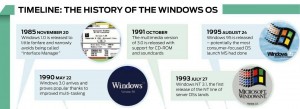
As we all know today Windows is the most popular and used operating system in the world but it was not the case before....Lets have a look how we reac...
!Avoid Dependencies In a library: Android/images/blog/2011/10/product-icon-4thumb2thumb.png
!Random Name Generator: Android/images/blog/2011/10/product-icon-4thumb.png
!10 Rules Every Android Programmer Should Know/images/blog/2011/10/it7SQxSNDamKw.pngthumb.jpg

!c7875ff7f880fe46f6b3067ecc30a41a-server-clip-art/images/blog/2011/10/c7875ff7f880fe46f6b3067ecc30a41a-server-clip-artthumb....

!bomb-icon/images/blog/2011/10/bomb-iconthumb.jpg
!Creating File Uploader For Window Phone 7/images/blog/2011/10/Network-Upload-icon.png
!Creating a Simple Download Manager For Window Phone 7/images/blog/2011/10/branchesdownload-300x300.png

!/images/blog/2011/10/emailicon.jpg
Technorati Tags: adf.ly,blogging,earning money,links Here is one awesome service for bloggers who want to earn more money from links. One thing I like about this , is easy integration in website, either you try mass shrike , or JavaScript to automatically convert all the links to ads(Don’t worry you can ad some links and domain to exception) You can also easy integrate this in your Google analytical account. Tip: Use this link to signup this service and you could win a chance to earn 20% extra on every signup. Happy Blogging and earn more money and share your comments.
Hey Guys. Hope you liked my previous post/create-simple-navigation-application/ for creating a simple Windows Phone 7...
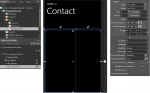
highlightCreate a simple navigation application in Windiows Phone 7 WP7 highlight
Yesterday i finally upgraded my iPhone 3GS to iOS 5 and below are the changes / updates / upgrades is what i saw. I thought it would be good option fo...

Some of the latest game play shots are available below along with features

The final decision rests on you but in this post i will try to narrow down as to when should you buy what...
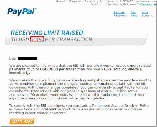
!/images/blog/2011/10/Capture101.png

Technorati Tags: paypal india,limits raised,3000$,usd
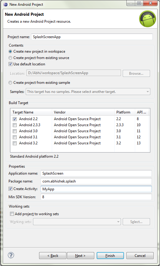
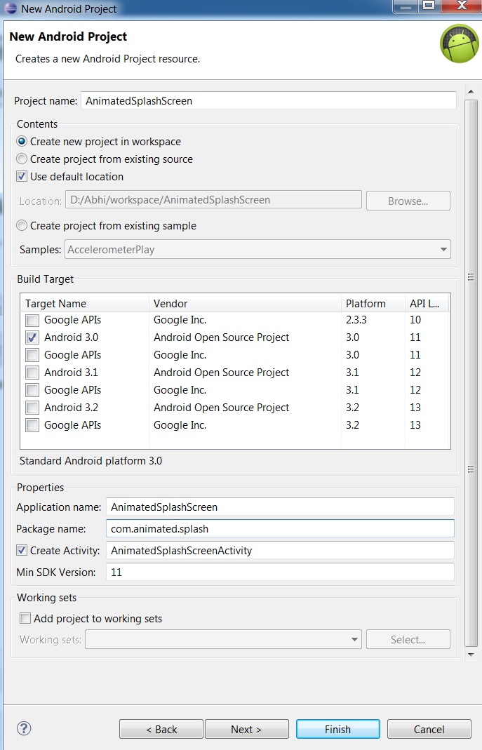
Create a new project in Eclipse named AnimatedSplashScreen
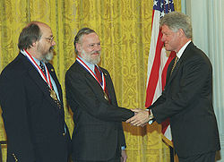
!DennisKenAward/images/blog/2011/10/250px-Medallg.jpeg
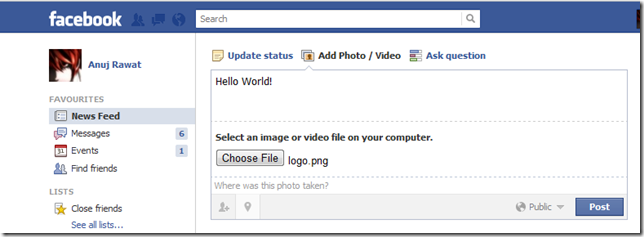
Technorati Tags: facebook,comment,photo,image hosting,trick,tips Post something and place an image!
Technorati Tags: Source,Code,Blogger,Wordpress,Typepad,SharePoint,visual basic,c,java
Open an image in Fireworks.

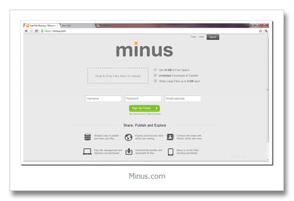
Technorati Tags: dropbox,online storage,11gb,hotlink alllowed,image hosting,FREE,minus,dropbox killer,competitor,amazon AWS,S3
Step 1: Do some Brainstorming , have an idea and visualize concept ![Brainstorming (1)thumb[7]](/images/blog/2011/10/Brainstorming-1thumb7thumb.jpg) Step 2: Many people don’t realize but you need to do some sort of drafting first, no matter how expert you are on subject ,you always have room for improvement. Step 3: Step up you tools, polish you skills, learn and commit mistakes. Every writer has to figure out what works best - and often has to select and discard different tools before they find the one that fits. -Nora Roberts Step 4: Take out your creativity, give flags to your inspiration Imagination is more important than knowledge. For while knowledge defines all we currently know and understand, imagination points to all we might yet discover and create. -Albert Einstein. Step 5: Use effective typography, images(don’t for get one image can explain thousand words) Step 6:Using quotes can help you to conquer readers mind. Step 7:Use statistics and some solid data, to make you reade...
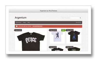
Technorati Tags: wordpress,theme,ecommerce,woo themes,new,release
!image/images/blog/2011/10/imagethumb.png

This article expects that you have your development enviorment set up and you have installed Eclipse and Android SDK and you have developed at least a...